The club has redrawn its badge for the first time since 1988. The symbols are the same. The drawing is not. Here is why it happened, and what it means for the club now and in the future.
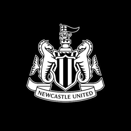
Newcastle United have a new crest, and at first glance you might not notice.
The castle is still there. So are the lion, the two seahorses and the black-and-white stripes. The ribbon still carries the club’s name. Nothing has been swapped out and nothing new has been added.
That is exactly what supporters asked for.
Why change it?
The old crest was drawn in 1988. It is 38 years old, and it was made for a different time.
Back then, a badge lived on a shirt, a programme and a ticket. Today it also has to look right on a phone screen, in a television graphic and in stitched thread. The club says the fine detail and uneven lines of the old design do not hold up in those places. Shapes blur and details disappear.
So the problem was not that supporters disliked the badge. They loved it. The problem was that it did not reproduce cleanly.
The club announced the plan in 2025 and called its approach “refine and revive”. The idea was to keep the crest and tidy it up, not to start again.
What the fans said
Newcastle spent more than two years asking supporters what they wanted. They ran focus groups, workshops and surveys.
The answer was clear. In the first round of surveys, 84 per cent of fans wanted key elements of the current crest kept. A circular badge was ruled out straight away, according to NUFC Blog’s account of the feedback. And the castle was named as the most important element of all.
That gave the designers a short brief. Keep everything and fix the drawing.
The vote
In August, supporters were given a poll with three options. All three were small changes to the existing crest.
More than 64 per cent of the 27,348 eligible season-ticket holders and members chose the third option. That is the crest the club has now unveiled.
What has changed
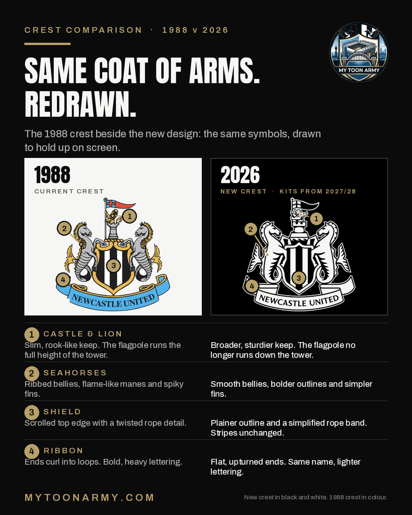
The castle has had the most work. The club says it has been fortified, made sharper and made more distinctive. The keep is now broader and sturdier than the slim tower on the 1988 crest.
The rest has been redrawn as well. The seahorses are smoother, with fewer lines on their bodies. The ribbon’s ends now sweep upwards. The stripes are unchanged.
The infographic above shows the two crests side by side.
A fair question
Not everyone was happy with the process early on. Newcastle United Supporters Trust said the first survey did not show whether most fans wanted any change at all. It pointed to an FA rule that says a club must be able to prove that most of its supporters back a material change to a crest.
The club went on to hold workshops and the August poll. A 64 per cent pick from three options shows which design fans preferred. It does not show how many fans wanted a change in the first place.
Even so, the changes are small, the process was long and fans had a say in the final choice.
What it means now
Nothing changes on the shirts this season. The old crest stays on the kit for 2026-27.
Everywhere else, the new crest starts to appear straight away. The club will introduce it over the coming months across signage, digital platforms and television graphics.
What it means for the future
The first shirt with the new crest will be the 2027/28 kit.
That makes this a long-term decision. The 1988 crest lasted 38 years, and clubs do not change their badge often. The new one is likely to be the crest that Newcastle fans, and the next generation of fans, grow up with.
It also fits a bigger picture. The club says the crest review is part of a wider look at every part of Newcastle United as it builds for sustainable success. Newcastle have been under the ownership of the Saudi Arabian sovereign wealth fund PIF since 2021, and the crest is the part of that wider work that supporters can see and wear.
The club has not said the change is about money. Its stated reason is clarity. But a badge that reproduces cleanly is easier to use on a shirt, a screen or a broadcast graphic, and those are the places where the club is seen.
Newcastle have changed the drawing, not the badge.
Until next season, the old crest stays on the shirt. The new one is already on the screen.
What do you think about the new crest? Love it? Hate it? Join the conversation on X @mytoonarmy #NUFC
Leave a Reply